
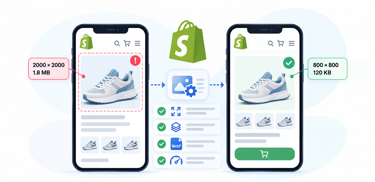
TL;DR: Shopify images that look fine on desktop can still be too large for mobile, causing unnecessary downloads and slower page loads. This guide explains how to resize and compress images, use responsive srcset and sizes, serve modern formats, and lazy-load images correctly so your Shopify store loads faster without sacrificing image quality.
If your Shopify store looks fine on desktop but Shopify images are too large on mobile, the problem may not be the visual dimensions you see on the screen. A product image can appear only 350px wide while the browser downloads a 1,200px or 2,000px version.
That wasted transfer matters on mobile connections. The 2025 Web Almanac found that Images remain one of the largest contributors to webpage weight.
The good news is that fixing Shopify mobile images that are too large is usually less about manually shrinking every image and more about making sure Shopify serves the right resource for the device and layout.
Why Are Shopify Images Too Large on Mobile?
Large Shopify images can slow mobile pages when the browser downloads an image that is much wider than the space it actually needs to fill. This can happen when the theme serves oversized image sources, uses an inaccurate sizes value, or doesn’t deliver images efficiently for the mobile layout.
| Problem | Fix |
|---|---|
| Images are larger than their displayed mobile size | Identify oversized images using PageSpeed Insights and Chrome DevTools |
| Shopify serves unnecessarily large image versions | Use responsive srcset and sizes to serve the appropriate image width |
| Product images have excessive dimensions or file size | Resize and compress original images before or during optimization |
| Images use larger or inefficient file formats | Use modern image formats such as WebP or AVIF where appropriate |
| Below-the-fold images load too early | Lazy-load below-the-fold images while keeping the LCP image appropriately prioritized |
| Mobile needs a different image composition | Use |
| Images are optimized, but mobile performance is still slow | Check JavaScript, apps, fonts, CSS, and other page resources that may affect loading |
What’s Causing Large Image Downloads on Mobile?
There are several reasons Shopify images too large on mobile can happen.
The file is larger than the displayed image
Suppose a product card occupies 360px on a phone, but its HTML points to a 1,500px image. The browser still has to download the larger resource even though CSS displays it at a much smaller size.
This is a responsive image sizing problem rather than simply an image compression problem. Shopify specifically recommends using srcset and sizes so the browser can select an appropriately sized source for the viewport.
Your theme may request unnecessarily large sources
A common Shopify mobile image problem appears in product grids. A theme may define several image candidates, but if the sizes attribute does not accurately describe the layout, the browser can choose a larger candidate than necessary.
For example, if a four-column desktop grid becomes a one-column mobile grid, the mobile image does not need the same width as the desktop version.
Shopify notes that an incorrect or missing sizes value can cause the browser to assume the image occupies the full viewport width and potentially download a larger source.
Compression and dimensions are different
An image can be highly compressed and still be too large. For example:
| Image | Dimensions | File size | Problem |
|---|---|---|---|
| A | 2000 × 2000 | 180 KB | Too many pixels for a small mobile card |
| B | 800 × 800 | 150 KB | More appropriate |
| C | 800 × 800 | 80 KB | Better optimized |
The important distinction is that compression reduces file weight, while resizing reduces the number of pixels the browser needs to download and process.
How to Fix Large Shopify Images on Mobile
Large Shopify images can slow mobile pages when they contain more pixels or data than the screen actually needs. The fixes include resizing and compressing images, serving responsive versions, using efficient formats, and loading images at the right time.
1. Identify the oversized images first
Before changing your Shopify theme, test the actual mobile page. Open Google PageSpeed Insights and inspect the image-related opportunities. Look for recommendations such as “Properly size images”, large image transfers, or images that are significantly larger than their rendered dimensions.
You can also open Chrome DevTools → Network → Img, reload the page, and inspect the image requests.
Compare:
Displayed width: 360px
Downloaded image width: 1600px
If you repeatedly see this pattern, you likely have a responsive sizing issue.
2. Use Shopify’s responsive image features
Shopify provides image_url and image_tag Liquid filters for generating image URLs and responsive markup. Its documentation recommends these filters rather than manually constructing CDN URLs.
A basic implementation can look like this:
The srcset provides several image widths, while sizes tells the browser approximately how wide the image will appear.
The browser can then select a suitable source instead of automatically downloading the largest available image.
3. Check your srcset and sizes
Shopify responsive images only work efficiently when the candidates and layout information make sense.
For example, a product grid that displays one product per row on mobile could use a pattern such as:
This is particularly important for Shopify product images too large on mobile because collection pages can contain dozens of product images. Shopify’s current theme guidance provides similar responsive sizing patterns for product grids.
4. Resize and compress the original product images
Responsive delivery does not eliminate the value of properly prepared source images. If your original product photography is unnecessarily huge, resize it to a sensible maximum before uploading or optimizing it.
Then compress it without making the product details look soft or artificial. The right Shopify image size for mobile depends on where the image appears. A full-width mobile hero may require a wider source than a small product-card thumbnail.
5. Use modern image formats where appropriate
File format also affects transfer size. Shopify’s image delivery system can automatically select supported formats such as WebP and AVIF where appropriate.
That means you do not necessarily need to manually create a separate WebP file for every Shopify image.
Still, format selection should be considered alongside dimensions and compression. A modern format cannot compensate for sending a 2,000px image to a 350px mobile component.
6. Lazy-load below-the-fold images
Not every image needs to load immediately. Product images below the initial viewport can generally be lazy-loaded so the browser does not request everything at once. Shopify recommends lazy loading images outside the initial viewport, while the LCP image should not be lazy-loaded.
This distinction matters. If your hero image is the LCP element, lazy-loading it can delay the largest visible content. Conversely, loading every product image on a long collection page immediately can create unnecessary network activity.
For a confirmed LCP image, Shopify also recommends using fetchpriority=”high” so the browser can prioritize that image earlier.
7. Use a separate mobile crop when the design actually requires one
Sometimes mobile does not just need a smaller version of the desktop image. It needs a different composition.
For example, a wide desktop banner may show a model standing beside a product, while the mobile version needs a tighter portrait crop.
In this situation, Shopify responsive image optimization can use the
Do not create separate mobile and desktop images simply because their dimensions differ. Use
What Image Size and Format Should You Use for Shopify Mobile?
There is no single Shopify image size for mobile that works for every store. Choose dimensions based on how large the image appears on the screen, then use an efficient format such as WebP or AVIF where appropriate.
| Use case | Recommended size and format approach |
|---|---|
| Product card | Serve an image close to the card’s rendered width, with higher-density candidates when needed. Use WebP or AVIF where supported. |
| Full-width mobile banner | Use a larger responsive image that matches the viewport width. Consider WebP or AVIF to reduce file size. |
| Product gallery | Provide responsive image candidates based on the gallery width and use an efficient modern format. |
| Thumbnail | Use a much smaller image than the main product image to avoid downloading unnecessary pixels. |
| Logo/icon | Use SVG when the graphic is suitable; otherwise, use an appropriately sized raster image. |
The goal is not to make every image as small as possible. Serve the right dimensions for the space the image occupies and use an efficient format without sacrificing the visual quality customers need.
For more detailed guidance on image dimensions, file sizes, and formats, check Shopify’s official image size guidelines. It covers recommended sizes for different image types and explains how to balance image quality with page performance.
Why Shopify Images May Still Load Slowly After Optimization
If Shopify images are loading slowly on mobile even after resizing and compression, the images may not be the only issue. Your theme’s JavaScript, third-party Shopify apps, fonts, CSS, and other network requests can also affect loading and rendering.
Check whether another page element is delaying the user experience, and review how your images contribute to Core Web Vitals. This can help you determine whether the remaining performance issue is image-related or coming from another part of the page.
Image optimization is important, but Shopify mobile page speed depends on the entire page, not images alone.
Shopify Mobile Image Optimization Checklist
Before considering the issue fixed, verify that:
-
Mobile pages are not downloading unnecessarily large desktop images.
-
Product grids have accurate srcset and sizes values.
-
Source images are appropriately resized and compressed.
-
Shopify’s responsive image filters are being used where applicable.
-
Above-the-fold/LCP images are loaded with the right priority.
-
Below-the-fold images use lazy loading where appropriate.
-
Mobile-specific crops use
when necessary. -
Image dimensions are defined to reduce layout shifts. Shopify’s image_tag can generate width and height attributes automatically.
-
PageSpeed Insights is checked after the changes, not just before them.
Conclusion
When Shopify images are too large on mobile, the solution is not simply to compress every image until the file size looks small. The more important question is whether the browser is receiving an image appropriate for the space it actually needs to fill.
Start by identifying oversized requests, then combine sensible image dimensions, compression, responsive srcset and sizes, modern formats, and appropriate loading behavior. For Shopify themes, using image_url and image_tag correctly provides a strong foundation for this approach.
The result is a lighter mobile page, faster image delivery, and a better foundation for Shopify mobile page speed and Core Web Vitals.
FAQs
Q1: How do I stop Google from indexing images?
Q2: Does noindex work for images?
Q3: Does robots.txt prevent images from being indexed?
Q4: What is noimageindex?
Q5: Can I remove an image from Google Search without deleting it from my website?
Q6: Does alt text affect whether Google indexes an image?
21 September, 2026
Leave a Comment
Ishan Makkar
He is a web performance specialist focused on image optimization and site speed. As the founder of Image Optimizer Pro, he helps businesses reduce image load times and improve Core Web Vitals. His work centers on delivering faster websites, better user experience, and measurable SEO gains without complex development.