
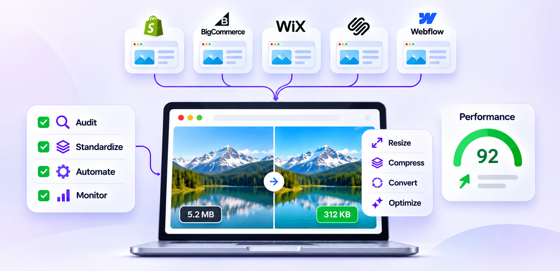
TL;DR: Managing image optimization for multiple websites is easier when you standardize image rules, audit each site separately, automate repetitive tasks, and monitor performance continuously. The goal is not to make every site identical, but to maintain consistent optimization standards while accounting for each platform’s requirements.
Managing one website’s images can be easy. But managing images across Shopify, Wix, WordPress, BigCommerce, Squarespace, Webflow, and other platforms is a different challenge.
Each website may have different image dimensions, templates, responsive-image behavior, CMS settings, and publishing workflows. At the same time, large or poorly optimized images can add unnecessary page weight and affect loading performance.
HTTP Archive’s 2025 Web Almanac reports that images account for approximately 1,058 KB of transferred data on a median desktop page and 911 KB on a median mobile page. This makes image optimization an important part of managing page weight and website performance.
That makes image optimization for multiple websites less about optimizing individual files and more about creating a repeatable system.
How Do You Manage Image Optimization Across Multiple Websites?
Managing image optimization across multiple websites requires a consistent workflow: audit each site, standardize image rules, automate repetitive tasks, and monitor performance regularly.
| Step | What to do |
|---|---|
| 1. Audit | Identify oversized, incorrectly formatted, duplicate, and poorly sized images on every website. |
| 2. Standardize | Set shared rules for formats, dimensions, compression, filenames, and quality. |
| 3. Adapt | Adjust those rules for each CMS, theme, template, and image delivery system. |
| 4. Automate | Automate compression, resizing, format conversion, and processing of new uploads where practical. |
| 5. Monitor | Recheck image weight, responsive delivery, LCP, and other performance signals regularly. |
| 6. Document | Keep one image optimization workflow so teams follow the same standards across properties. |
Why Image Optimization Becomes Difficult Across Multiple Websites
The biggest problem is usually inconsistency. One website might use properly sized WebP images, while another still contains oversized JPEGs.
A third might automatically generate responsive variants, while a fourth requires additional configuration. Even when the original images come from the same asset library, the way they are delivered can differ substantially.
For example, an ecommerce company operating separate Shopify and BigCommerce stores may use the same product photography but require different image workflows. Platform-specific details matter, which is why a Shopify workflow should be evaluated separately from a BigCommerce workflow.
For Shopify stores, factors such as responsive images and theme implementation deserve particular attention. The same principle applies to other platforms as well.
Create One Image Optimization Standard for Every Website
The best approach to multi-site image optimization is to establish common rules first, then adapt them to individual platforms.
Your standard can define:
- Preferred image formats for different asset types
- Maximum practical dimensions
- Compression targets
- Quality requirements
- Responsive image expectations
- Naming and metadata conventions
- Rules for hero, product, thumbnail, and decorative images
- How newly uploaded images are processed
This creates consistent image optimization without forcing every website to use exactly the same implementation. For example, a useful policy could be:
| Asset | Standard |
|---|---|
| Product photography | JPEG/WebP depending on platform and use case |
| Logos and simple graphics | SVG where appropriate |
| Transparent graphics | PNG or another suitable format |
| Large photographic assets | Resize before delivery and compress appropriately |
| Mobile delivery | Serve an appropriately sized responsive variant |
| Below-the-fold images | Lazy-load when appropriate |
| Important above-the-fold images | Avoid unnecessary lazy loading |
Format selection should depend on the image rather than applying one format universally.
A Practical Framework for Multi-Site Image Optimization
This practical multi-site framework helps teams apply the same optimization standards while adapting image handling to each platform’s specific requirements, workflows, and delivery methods.
Audit Each Website Before Making Changes
A centralized strategy does not mean blindly applying the same optimization settings everywhere.
Start by auditing each property.
Look for oversized images, excessive dimensions, inefficient formats, duplicate assets, missing responsive variants, and images that are loaded when they are not immediately needed.
A simple image optimization management spreadsheet can track:
| Website | Platform | Main issue | Priority | Action |
|---|---|---|---|---|
| Store A | Shopify | Oversized product images | High | Resize + compress |
| Store B | Wix | Large hero images | High | Resize + review loading |
| Store C | WordPress | Unoptimized media library | Medium | Bulk optimization |
| Store D | Webflow | Incorrect responsive sizing | Medium | Review image implementation |
For larger portfolios, automated crawling can make this process considerably easier. A useful audit should identify problems by website, page type, asset type, and severity rather than simply producing one large list of image URLs.
Standardize Image Dimensions and File Size
One of the most common mistakes in multi-site image management is uploading a large source image and relying on the browser or CMS to handle everything afterward.
If an image is displayed at 800 pixels wide but a 3000-pixel version is unnecessarily downloaded, compression alone does not solve the underlying problem. Dimensions and file size should therefore be managed together.
For ecommerce sites, establish practical dimensions for product images, thumbnails, banners, and gallery images. For content sites, define separate expectations for featured images and editorial media.
The right size depends on the actual display context, so there is no universal file-size or dimension limit that works for every website.
Use a Repeatable Image Optimization Workflow
A scalable image optimization workflow should follow roughly the same sequence for every website:
Upload → Inspect → Resize → Compress → Convert when appropriate → Deliver → Validate → Monitor
The important point is that automation should handle repetitive work while humans retain control over exceptions.
For example, a product team might upload a 4000 × 4000 product photograph. The workflow can identify the source dimensions, generate appropriately sized versions, compress them, and prepare them for the relevant website.
The same workflow can then be applied to hundreds or thousands of assets rather than manually processing every file. Bulk image optimization is useful in managing websites with large image assets.
Centralize the Process, Not Necessarily the Files
Centralized image optimization does not always mean storing every image for every website in one location. A better approach is often to centralize the rules, monitoring, and workflow while allowing each platform to retain its appropriate delivery system.
For example, a company with five websites can maintain one optimization policy covering:
- Maximum source dimensions
- Compression expectations
- Preferred formats
- Responsive image requirements
- Naming conventions
- Quality checks
- Performance thresholds
Each website can then implement those rules according to its own CMS and frontend. This distinction matters because a Shopify theme, WordPress installation, and Webflow project may handle image transformation and delivery differently.
For larger website portfolios, assign responsibility for maintaining the shared optimization standards. A central owner or team can manage the guidelines, review performance reports, and coordinate changes, while individual website managers handle platform-specific implementation and visual quality checks. This keeps the process consistent without requiring every website to follow an identical technical setup.
Automate New Images, Not Just Existing Libraries
Optimizing the existing image library is only half the job. If new uploads are not processed, an optimized website can gradually become slower again. This is especially common with ecommerce sites where new products, seasonal banners, campaign graphics, and editorial images are added every week.
A stronger multi-site image management process includes an ongoing rule:
Every new image enters the optimization workflow before or immediately after publication.
Automation can help with resizing, compression, format conversion, and asset checks. Modern image workflows can also automate compression and encoding as part of the development or publishing process.
This is where automated image optimization can reduce repetitive work across multiple properties while keeping the underlying standards consistent.
Monitor Performance After Optimization
An image is not truly optimized just because its file size is smaller. After changes, check how images behave on the actual page.
Look at:
- Image transfer size
- Displayed versus intrinsic dimensions
- Responsive image selection
- Largest Contentful Paint
- Loading priority
- Lazy-loading behavior
- Mobile performance
- Visual quality
Images can be particularly important for LCP. HTTP Archive has reported that images frequently serve as the LCP element, making image delivery an important part of page-performance work.
Use PageSpeed Insights, browser DevTools, and real-user performance data where available. If images remain a problem after compression, investigate whether the issue is actually dimensions, loading priority, responsive delivery, or another page-level issue.
Before making optimization changes, record baseline performance for representative pages on each website, including important product pages, category pages, and landing pages. After optimization, test the same URLs under comparable conditions and compare image transfer size, LCP, and other relevant performance metrics.
In PageSpeed Insights, distinguish between Lighthouse lab results and real-user field data when available. Lab tests help identify implementation issues, while field data shows how visitors actually experience the website. Repeat these checks after significant image, theme, or design changes.
Build a Platform-Specific Optimization Checklist
Once the common rules are established, create a short checklist for each platform.
For example:
Shopify: Check theme image rendering, responsive variants, product-image dimensions, and app/theme interactions.
Wix: Review automatically handled image processing alongside uploaded image dimensions and page-specific assets.
WordPress: Check the media library, theme behavior, responsive markup, plugins, and generated image variants.
Webflow: Review responsive image settings, asset dimensions, and how images are served within the site’s design system.
BigCommerce: Check storefront implementation, product-image requirements, responsive delivery, and theme behavior.
This gives teams a shared framework without assuming that every CMS behaves the same way.
Avoid Optimizing Every Image the Same Way
Uniformity is useful for processes, but not necessarily for image settings.
A product photograph may benefit from lossy compression. A logo with transparency may require a different format. A small decorative icon may be better represented as SVG. A high-resolution editorial image may need resizing before compression.
The objective is consistent image optimization, not identical image treatment.
Likewise, lazy loading should be applied based on where an image appears and whether it is needed immediately. Images below the fold can generally be lazy-loaded, but the main above-the-fold image, particularly the one identified as the Largest Contentful Paint (LCP) element, should not be lazy-loaded. Where appropriate, use fetchpriority="high" to help the browser prioritize that image. Responsive images and loading strategies solve different problems and should be evaluated separately.
Use a Central Dashboard or Tracking System
When managing several websites, visibility becomes just as important as optimization. Track each property using a simple dashboard containing:
| Metric | Why it matters |
|---|---|
| Total image count | Shows library growth |
| Oversized assets | Identifies unnecessary image weight |
| Average image size | Helps spot deterioration |
| Unoptimized new uploads | Prevents regression |
| LCP-related images | Connects image work with performance |
| Optimization status | Shows which sites need attention |
This turns image optimization from a one-time cleanup project into ongoing image optimization management.
For organizations with frequent content changes, automated reporting can also flag new problems rather than waiting for a quarterly audit.
Common Mistakes in Multi-Site Image Optimization
A few image optimization mistakes repeatedly create problems when teams scale image optimization across websites.
Applying one rule to every platform: Different CMSs and themes have different image-generation and delivery behaviors.
Compressing without resizing: A smaller 3000-pixel image may still be unnecessarily large when the displayed image is only 800 pixels wide.
Optimizing only existing images: New uploads can quickly reintroduce the same problems.
Using modern formats indiscriminately: Format choice should consider transparency, image content, browser support, delivery requirements, and quality.
Ignoring responsive delivery: Serving one large image to every device wastes bandwidth even when the original file has been compressed.
Measuring only file size: Performance should be evaluated on the page, not just in an image editor.
When Should Image Optimization Be Centralized?
Centralization makes the most sense when multiple websites share teams, content processes, product photography, or brand assets.
It is especially useful when:
- The same team manages several ecommerce stores.
- New images are published frequently.
- Multiple websites use shared product photography.
- Image libraries contain thousands of assets.
- Different teams currently follow inconsistent optimization practices.
However, centralization should provide shared standards and visibility, not remove the platform-specific decisions required for each website.
Conclusion
Effective image optimization for multiple websites is primarily a process-management problem. The strongest approach combines shared optimization standards with platform-specific implementation.
Audit each website, standardize the fundamentals, resize images appropriately, automate repetitive work, monitor new uploads, and validate performance on real pages. This creates a scalable image optimization workflow that keeps multiple websites consistently optimized without treating every platform as if it works the same way.
FAQs
How do you optimize images for multiple websites?
What is the best way to manage image optimization across multiple websites?
Can image optimization be automated across multiple websites?
Should every website use the same image format?
How often should websites be checked for image optimization issues?
Does compressing images automatically improve Core Web Vitals?
12 November, 2026
Leave a Comment
Ishan Makkar
He is a web performance specialist focused on image optimization and site speed. As the founder of Image Optimizer Pro, he helps businesses reduce image load times and improve Core Web Vitals. His work centers on delivering faster websites, better user experience, and measurable SEO gains without complex development.