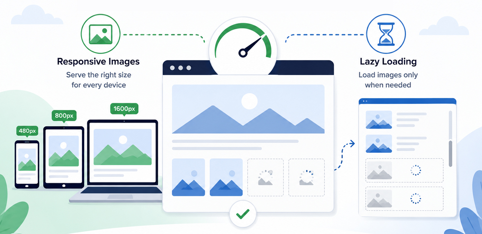
TL;DR: Responsive images and lazy loading improve page speed in different ways. Responsive images ensure users download the most appropriate image size for their device, while lazy loading delays off-screen images until they are needed. When used together, they reduce unnecessary data transfer, lower initial page weight, and create a faster, more efficient browsing experience across desktop and mobile devices.
A common reason websites feel slow isn’t the number of images they use, it’s how those images are delivered. Large image files can increase page weight, consume bandwidth, and delay the loading of important content, especially on mobile devices.
This is where responsive images vs lazy loading becomes important. Responsive images ensure users receive appropriately sized images for their device, while lazy loading delays off-screen images until they’re needed.
Rather than choosing one over the other, modern websites achieve the best performance by using both techniques together. Understanding how these techniques work together can help website owners make smarter image optimization decisions and improve page speed more effectively.
Responsive Images vs Lazy Loading at a Glance
Before looking at the technical details, here’s a quick comparison of responsive images and lazy loading. This overview highlights how each technique improves page speed and why they work best when used together.
| Aspect | Responsive Images | Lazy Loading | Combined Impact |
|---|---|---|---|
| Primary Purpose | Deliver the smallest suitable image for each device | Delay off-screen images until needed | Reduce unnecessary image data and speed up loading |
| Optimizes | Image file size and bandwidth usage | Initial page requests and render time | Overall page speed and loading efficiency |
| Main Benefit | Faster downloads on all devices | Quicker initial page display | Better performance, especially on mobile |
| Best For | Sites with multiple screen sizes | Pages with many images or long content | Websites that want faster load times and smoother UX |
| Impact on Page Speed | Lowers transfer size and speeds up image loading | Reduces upfront network load | Improves speed from both file-size and request savings |
| Recommended Approach | Use for all responsive image delivery | Use for below-the-fold images | Use both together for the best speed improvement |
What Are Responsive Images?
Responsive images allow browsers to choose the most appropriate image file based on a visitor’s screen size, viewport dimensions, and device resolution.
Without responsive images, every visitor may receive the same large image regardless of whether they are browsing on a desktop monitor or a smartphone.
For example:
| Device | Screen Width | Image Delivered |
|---|---|---|
| Mobile | 390px | 480px image |
| Tablet | 768px | 800px image |
| Desktop | 1440px | 1600px image |
Instead of downloading a massive desktop-sized image on mobile devices, the browser selects a smaller version that matches the screen.
Example of Responsive Images
<img
  src="image-800.jpg"
  srcset="
    image-480.jpg 480w,
    image-800.jpg 800w,
    image-1600.jpg 1600w"
  sizes="(max-width: 768px) 100vw,
    (max-width: 1200px) 50vw,
    800px"
  alt="Example image">
Using srcset and sizes, browsers can intelligently choose the best image version for each device. This reduces unnecessary downloads and improves responsive image performance.
Benefits of Responsive Images
Responsive images help:
- Reduce bandwidth usage
- Improve mobile performance
- Speed up page rendering
- Improve Core Web Vitals
- Prevent oversized image downloads
These benefits become particularly noticeable on mobile devices, where screen sizes, network speeds, and data limits vary significantly. For mobile users, especially, responsive images can significantly reduce transferred bytes and loading times.
What Is Lazy Loading?
Lazy loading images delays image downloads until they are needed.
Instead of loading every image immediately when a page opens, the browser delays loading off-screen images until they’re close to entering the viewport.
Native lazy loading is supported by all major modern browsers through the loading=”lazy” attribute. Older browsers that don’t support it simply load images normally.
Example of Lazy Loading
<img
  src="product-image.jpg"
  loading="lazy"
  alt="Product image"
  width="600"
  height="400">
This tells the browser to postpone loading the image until it approaches the viewport.
Why Lazy Loading Matters
Many pages contain dozens or even hundreds of images.
Without lazy loading:
- More network requests compete for bandwidth.
- Critical content loads more slowly.
- Every image starts downloading immediately.
With lazy loading:
- Above-the-fold content loads first.
- Fewer resources compete during initial rendering.
- Users experience faster page loads.
According to Google’s performance guidance, lazy loading can significantly reduce unnecessary image downloads and network contention when implemented correctly.
Responsive Images vs Lazy Loading: What’s the Difference?
Although both improve performance, they solve different problems.
| Feature | Responsive Images | Lazy Loading |
| Purpose | Serve the correct image size | Delay image loading |
| Focus | Reduce image weight | Reduce initial requests |
| Works On | All images | Primarily off-screen images |
| Benefit | Less bandwidth usage | Faster initial page load |
| Implementation | srcset, sizes, picture | loading=”lazy” |
| Mobile Impact | High | High |
| SEO Impact | Positive | Positive when used correctly |
Think of it this way:
Responsive images answer:
“Which image size should the browser download?”
Lazy loading answers:
“When should the browser download it?”
The two techniques complement each other rather than compete.
Should You Use Responsive Images or Lazy Loading First?
If you can only implement one technique first, start with responsive images.
Responsive images help every visitor by ensuring the browser downloads the right image size for the device. That means smaller files, less bandwidth use, and faster loading across mobile and desktop.
Lazy loading is also valuable, but it only affects images below the fold. It reduces initial page weight, but it works best after your images are already properly sized. In simple terms:
- Responsive images control what gets downloaded.
- Lazy loading controls when it gets downloaded.
If possible, use both. Responsive images reduce file size, and lazy loading reduces initial requests. Together, they create a faster and more efficient page load.
How Responsive Images and Lazy Loading Work Together to Improve Page Speed
To see why responsive images and lazy loading work so well together, it helps to look at how a browser loads a page. Imagine an ecommerce category page with 40 product images.
Scenario 1: No Image Optimization
When a visitor lands on the page:
- The browser finds all 40 images.
- Every image starts downloading right away.
- Mobile users get the same large images as desktop users.
- Bandwidth gets split across too many requests.
- Important content takes longer to appear.
The result is a slower page, higher data usage, and a worse user experience.
Scenario 2: Responsive Images Only
Now imagine the same page using responsive images. The browser still loads all 40 images immediately, but it chooses the best size for each device.
A mobile user might receive a 480-pixel image instead of a 1600-pixel version, which cuts down the amount of data transferred. This improves efficiency, but every image still loads during the initial visit.
Scenario 3: Lazy Loading Only
With lazy loading enabled, the browser loads only the images visible in the initial viewport. Images further down the page are delayed until the visitor scrolls.
This reduces initial requests and helps the page appear faster. However, the images that do load may still be larger than necessary if responsive image techniques are not used.
Scenario 4: Responsive Images and Lazy Loading Together
This is where the biggest performance gains happen. The browser loads only the images that are immediately visible, and each one is served in the most appropriate size for the user’s device.
As visitors scroll, additional images load only when needed, again using optimized image dimensions.
This approach improves page speed in two ways:
- Fewer images load initially.
- Each image transfers fewer bytes.
Instead of choosing between responsive images and lazy loading, modern websites should use both. One reduces image weight, while the other reduces image requests. Together, they create a faster and more efficient loading experience for desktop and mobile users alike.
Best Practices for Combining Responsive Images and Lazy Loading
When implemented correctly, responsive images and lazy loading complement each other, helping reduce image payloads, minimize unnecessary requests, and improve overall page speed.
1. Use Responsive Images First
Always serve appropriately sized images using:
- srcset
- sizes
<picture>when needed
This ensures browsers never download larger files than necessary.
This ensures browsers never download larger files than necessary.
Images that users cannot immediately see are ideal candidates for lazy loading.
<img
  src="gallery-image.jpg"
  srcset="..."
  sizes="..."
  loading="lazy"
  alt="Gallery image">
This combines both optimization methods in a single implementation.
3. Do Not Lazy Load Hero Images
One of the most common mistakes is lazy loading above-the-fold content.
Google’s performance guidance recommends eagerly loading images visible in the initial viewport, especially LCP images. Lazy loading of these assets can delay rendering and negatively affect Core Web Vitals.
4. Include Width and Height Attributes
Always define image dimensions.
<img
  src="image.jpg"
  width="1200"
  height="800"
  loading="lazy"
  alt="Example">
This helps prevent layout shifts and improves visual stability.
5. Use Modern Image Formats
Responsive images become even more effective when combined with modern formats like WebP and AVIF.
Modern image formats typically deliver the same visual quality at smaller file sizes than traditional JPEG images, helping pages load more efficiently.
Common Responsive Image and Lazy Loading Mistakes
Even when using responsive images and lazy loading, a few image optimization mistakes can limit their effectiveness or even create new performance issues.
Lazy Loading Everything
Not every image should be lazy-loaded. Critical images, such as hero banners, featured product images, and other above-the-fold content, should load immediately. Applying lazy loading to these images can delay rendering and negatively impact Largest Contentful Paint (LCP).
Serving One Large Image to Every Device
Responsive images exist specifically to prevent this issue. Sending the same large image to smartphones, tablets, and desktops wastes bandwidth and forces smaller devices to download more data than necessary, slowing down page loads.
Missing Dimensions
Failing to specify image dimensions can cause layout shifts as images load. Defining width and height attributes helps browsers reserve the correct space on the page, creating a more stable user experience and supporting better Core Web Vitals.
Ignoring Mobile Users
Mobile visitors benefit the most from responsive image performance improvements because bandwidth and screen sizes are often limited.
Conclusion
The discussion around responsive images vs lazy loading is not about choosing one technique over the other. Responsive images reduce the amount of data transferred, while lazy loading controls when that data is transferred.
Together, they form a highly effective image loading optimization strategy that improves page speed, enhances user experience, reduces bandwidth consumption, and supports better Core Web Vitals. For modern websites, using responsive images and lazy loading together is no longer optional; it is a fundamental image optimization best practice.
FAQs
Q1. What is the difference between responsive images and lazy loading?
Q2. Do responsive images improve page speed?
Q3. Does lazy loading improve website performance?
Q4. Should I use responsive images and lazy loading together?
Q5. How do responsive images help mobile users?
Q6. Which images should not be lazy-loaded?
26 June, 2026
Leave a Comment
Ishan Makkar
He is a web performance specialist focused on image optimization and site speed. As the founder of Image Optimizer Pro, he helps businesses reduce image load times and improve Core Web Vitals. His work centers on delivering faster websites, better user experience, and measurable SEO gains without complex development.