TL;DR: Oversized images are one of the top reasons mobile visitors leave without buying. They inflate page weight, delay the first render, shift your layout mid-scroll, and quietly drain your revenue, even when your design looks perfectly fine on a desktop browser.
Mobile users account for the majority of web traffic today, yet many websites are still designed and optimized with desktop experiences in mind. One of the most common performance issues is serving images that are far larger than necessary for mobile screens.
When large images affect mobile conversion rates, the consequences go beyond slower load times. Oversized images can delay important content, increase bounce rates, create frustrating user experiences, and reduce trust in your website. They can even impact search visibility by hurting Core Web Vitals.
For eCommerce stores and lead-generation websites alike, image size is no longer just a design consideration. It’s a conversion factor. Understanding how large images impact mobile users can help explain why seemingly healthy traffic numbers often fail to turn into sales or leads.
Quick Breakdown: Where Large Images Hurt Mobile Conversions
Before diving into the details, here’s a quick overview of the most common ways large images affect mobile conversion rates and how to minimize their impact.
| Issue | Impact on Conversions | Quick Fix |
|---|---|---|
| Slow page loading | Visitors leave before the page fully loads | Compress images and use modern formats like WebP or AVIF |
| High data usage | Mobile users may abandon pages that consume too much data | Reduce image file sizes and serve responsive images |
| Hidden CTAs | Important buttons and product details appear later | Optimize above-the-fold images for faster loading |
| Layout shifts (CLS) | Users tap the wrong element or experience frustration | Define image dimensions before loading |
| Device performance issues | Slow scrolling and delayed interactions hurt engagement | Resize images to match display requirements |
| Reduced trust | Slow or blurry image rendering creates a poor impression | Prioritize fast-loading, high-quality visuals |
| Lower search visibility | Poor Core Web Vitals can reduce mobile traffic | Optimize images that affect Largest Contentful Paint (LCP) |
The Real Cost of Ignoring Image Size on Mobile
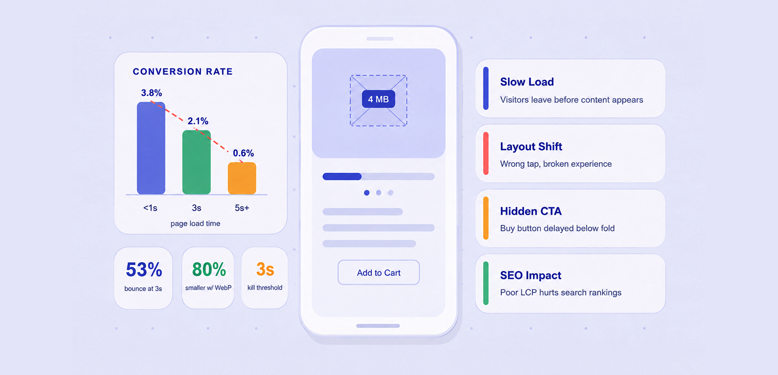
Here’s a scenario most store owners don’t think about: a shopper opens your product page on their phone while commuting. The hero image is a 4MB JPEG exported from a camera. Your page starts loading. Three seconds pass. They leave.
That’s not just a bounce, it’s a sale you’ll never track as lost. The large image issue on mobile is deceptively invisible, and in many cases, it could have been prevented by optimizing images with an image compressor before they were uploaded.
7 Ways Large Images Hurt Mobile Conversions
Large images affect mobile conversion rates in several ways. Beyond slowing down page loads, they can hide important content, create frustrating user experiences, and even reduce the amount of traffic reaching your website. Here’s why oversized images have such a direct impact on mobile conversions.
1. Page Load Speed – The Most Direct Hit
Mobile users expect websites to load quickly, but large images can significantly increase loading times. A 3MB image that loads instantly on a desktop may take several seconds on a mobile connection. Since images are often the largest files on a page, they are usually the biggest contributor to slow load times.
The result is simple: the longer users wait, the more likely they are to leave before viewing your content, products, or offers. According to Google’s research, 53% of mobile visitors leave if a page takes longer than three seconds to load. That’s not an edge case, that’s the majority behavior on slow pages.
How to avoid it:
Compress images before uploading and use modern formats such as WebP or AVIF to reduce file size without noticeable quality loss.
2. Bandwidth and Data Costs Drive Abandonment
Not every mobile user is on an unlimited plan. In high-traffic markets like Southeast Asia, Latin America, and South Asia, a significant portion of shoppers are on capped or metered data. When your page transfers 8-10MB of uncompressed images in one visit, it isn’t just slow, it’s expensive for the user.
That creates an entirely different kind of friction: one where abandonment is a rational economic decision, not just impatience. Keeping images lean is a form of respect for how people actually use their phones.
How to avoid it:
Serve responsive images so mobile users only download the appropriate image sizes for their device.
3. Above-the-Fold Blocking Hides Your CTA
A large image at the top of a page can delay everything beneath it, including product details, pricing, contact forms, or “Add to Cart” buttons.
On mobile screens, where space is limited, users may spend their first few seconds waiting for an image instead of seeing the content that encourages them to take action.
How to avoid it:
Keep hero images lightweight and prioritize loading essential content and calls to action.
4. Rendering and Layout Shifts Break the Experience
When a browser doesn’t know the dimensions of an image before it loads, it reserves no space for it. The result: text, buttons, and CTAs render first, the user goes to tap something, and then the image loads, pushing everything down and registering the tap in the wrong place. This is what Google measures as Cumulative Layout Shift (CLS), and it’s a direct path from oversized images to frustrated users who feel like the page is broken. A layout that jumps around mid-interaction destroys trust in seconds.
How to avoid it:
Always define image dimensions and reserve space for images before they load.
5. Memory and CPU Strain on Low-End Devices
Large, high-resolution images require more processing power to decode and display. While newer smartphones handle this better, many users still browse on older or lower-powered devices.
Heavy images can lead to laggy scrolling, delayed interactions, and slower page responsiveness, all of which negatively affect the user experience.
How to avoid it:
Resize images to their actual display dimensions and avoid uploading unnecessarily high-resolution files.
6. Poor Perceived Performance Erodes Brand Trust
Users often judge a website within seconds. If images load slowly, appear blurry while rendering, or cause visible delays, the website can feel less professional.
Even when visitors don’t consciously notice the issue, slow visual performance can reduce confidence in the brand and make them less likely to convert.
How to avoid it:
Optimize images for fast rendering so pages appear complete and polished as quickly as possible.
7. The SEO Knock-On Effect Reduces Traffic Before It Even Converts
Large images affect mobile conversion rates not only after visitors arrive but also before they reach your site. Oversized images often hurt Core Web Vitals, particularly Largest Contentful Paint (LCP), which can impact search visibility.
Poor image performance can lead to lower rankings, fewer visitors, and ultimately fewer opportunities to generate conversions. The impact extends beyond page speed and into overall traffic growth.
How to avoid it:
Regularly monitor Core Web Vitals and optimize large images that affect Largest Contentful Paint (LCP).
When Do Large Images Start Affecting Mobile Performance?
An image becomes too large when its file size or dimensions are significantly bigger than what a mobile device actually needs to display. For example, uploading a 4000-pixel-wide image for a screen that only shows it at a few hundred pixels creates unnecessary downloads and slower loading times.
As a general rule:
| Image Type | Recommended Size |
|---|---|
| Hero/Banner Images | Under 150–200 KB |
| Product Images | Under 100 KB |
| Thumbnail Images | Under 30–40 KB |
Many websites still upload full-resolution JPEG or PNG files directly from cameras or design tools, resulting in images that are much larger than necessary. Using modern formats like WebP or AVIF and running files through an image compressor can significantly reduce file size while maintaining visual quality.
This small change can have a noticeable impact on large images website performance and mobile user experience.
Conclusion
Large images affect mobile conversion rates through multiple mechanisms, not just load time, but data costs, layout stability, device capability, perceived quality, and organic reach. Each one alone is damaging.
Together, they make unoptimized images one of the highest-impact technical problems on any mobile-first store. Image compression, modern formats, and responsive delivery aren’t advanced optimizations, they’re the baseline for a page that earns conversions on mobile.
FAQs
Q1. Do large images affect mobile conversion rates?
Q2. Why do oversized images slow down mobile websites?
Q3. Can slow-loading images increase bounce rates?
Q4. How do large images impact ecommerce sales?
Q5. Can image optimization improve mobile conversion rates?
16 June, 2026
Leave a Comment
Ishan Makkar
He is a web performance specialist focused on image optimization and site speed. As the founder of Image Optimizer Pro, he helps businesses reduce image load times and improve Core Web Vitals. His work centers on delivering faster websites, better user experience, and measurable SEO gains without complex development.