
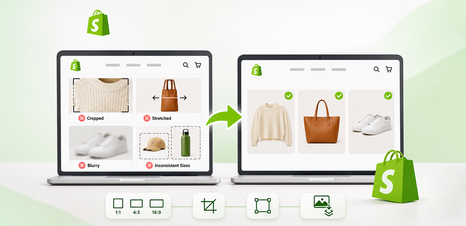
TL;DR: Shopify images that look incorrectly sized are usually caused by inconsistent aspect ratios, theme cropping settings, incorrect image dimensions, or distorted source files. Fix them by standardizing image ratios, adjusting theme settings, resizing images proportionally, and compressing large files without noticeably affecting quality.
Shopify images may appear stretched, cropped, blurry, or inconsistent even when they look correct before uploading. This usually happens because the original image dimensions do not match the display container, product images have different aspect ratios, or the Shopify theme applies automatic cropping.
To fix Shopify image sizing issues, check the original image dimensions, maintain consistent aspect ratios, adjust your theme’s image display settings, and resize images without distorting their proportions. You should also optimize image file sizes separately to avoid unnecessary page weight.
How to Fix Shopify Image Sizing Issues: Checklist
- Check image dimensions: Use Shopify’s recommended 2048 × 2048 pixels for square product images.
- Maintain consistent aspect ratios: Use the same ratio for product images displayed together in collection grids.
- Fix theme cropping: Check product card and image settings in your Shopify theme editor.
- Resize proportionally: Maintain the original width-to-height ratio to prevent stretching.
- Compress large images: Reduce file sizes while preserving visual quality.
- Test across devices: Check product images on desktop and mobile to confirm they display correctly.
Quick Troubleshooting: Common Shopify Image Problems and Fixes
| Image problem | Possible cause | Recommended fix |
|---|---|---|
| Blurry images | Low-resolution source | Upload a higher-resolution original |
| Cropped images | Theme image ratio | Adjust image fit or ratio |
| Stretched images | Incorrect resizing | Preserve the aspect ratio |
| Uneven product grids | Different proportions | Standardize image ratios |
| Slow-loading images | Excessive transferred image data | Check delivered dimensions and compression |
| Mobile display problems | Responsive layout or crop settings | Review mobile theme settings |
Tip: If an image looks correct in Shopify Admin but cropped on the storefront, check theme settings before reuploading it.
Why Are My Shopify Images Not Properly Sized?
Shopify images are often displayed incorrectly because their original aspect ratios differ from the dimensions of the theme’s image containers. Theme settings, automatic cropping, and incorrectly resized source files can also cause display problems. Here are the most common reasons:
1. Inconsistent image aspect ratios: Product images with different width-to-height ratios may appear uneven in collection grids. For example, a square product photo and a portrait product photo might occupy different amounts of vertical space.
2. Incorrect theme image settings: Shopify themes can crop images to fit predefined layouts. If a product card uses a square image container, a portrait image may lose some of its content.
3. Incorrect resizing: Changing an image’s width without adjusting its height proportionally can stretch or compress the subject.
4. Low-resolution source images: Small images enlarged to fit larger display areas can appear blurry or pixelated.
5. Oversized image files: Large image files can increase the amount of data browsers need to download. This is a file-size optimization issue, even when the displayed dimensions look correct.
A real Shopify merchant described a related problem in the Shopify Community:
“My product images on my landing page don’t look the same as they do on their respective collection page.”
This example illustrates why image appearance should be checked across different Shopify sections, not just on individual product pages.
Image Resizing vs. Image Compression: What’s the Difference?
Resizing changes an image’s pixel dimensions; cropping removes parts of an image to fit a composition; and compression reduces its file size. A compressed image can still be cropped by a theme, and a correctly sized image can still be unnecessarily large.
What Are the Recommended Image Sizes for Shopify?
Shopify recommends different image dimensions depending on where an image appears on your storefront. Product images, hero images, banners, blog images, and logos each have different display requirements. Using suitable dimensions for each placement helps maintain image clarity and consistent layouts across desktop and mobile devices.
Here are illustrative starting points drawn from Shopify’s image size guidelines. These are not universal upload requirements; theme layouts and responsive settings determine suitable dimensions.
| Image type | Desktop dimensions (W × H) | Mobile dimensions (W × H) | Aspect ratio |
|---|---|---|---|
| Background image | 2560 × 1440 px | 360 × 640 px | 16:9 / 9:16 |
| Hero image | 1280 × 720 px | 360 × 200 px | 16:9 |
| Website banner | 1200 × 400 px | 360 × 120 px | 3:1 |
| Blog image | 1200 × 800 px | 360 × 240 px | 3:2 |
| Rectangle logo | 400 × 100 px | 160 × 40 px | 4:1 |
| Square logo | 100 × 100 px | 60 × 60 px | 1:1 |
| Favicon | 48 × 48 px | 48 × 48 px | 1:1 |
| Social media icon | 32 × 32 px | 48 × 48 px | 1:1 |
| Lightbox image | 1920 × 1080 px | 360 × 640 px | 16:9 / 9:16 |
| Thumbnail image | 300 × 300 px | 90 × 90 px | 1:1 |
| Product thumbnail | 150 – 300 × 150 – 300 px | 150 – 300 × 150 – 300 px | 1:1 |
For Shopify product images specifically, Shopify recommends 2048 × 2048 pixels for square images. Images must be larger than 800 × 800 pixels for zoom functionality to work. Product and collection images can be uploaded at up to 5000 × 5000 pixels or 25 megapixels, with a maximum file size of 20 MB per image.
These dimensions are reference points rather than rigid requirements for every Shopify theme. Your theme’s layout, image containers, and responsive settings determine how images appear on the storefront.
For example, a product image uploaded at 2048 × 2048 pixels may be displayed at a much smaller size in a collection grid. Shopify’s image CDN automatically generates appropriately sized versions for different display requirements, so you do not need to manually upload separate images for every screen size.
The important thing is to maintain suitable image dimensions and aspect ratios, avoid unnecessary cropping, and optimize file sizes without noticeably affecting image quality.
How to Diagnose Shopify Image Sizing Problems
Before resizing every image in your store, identify whether the problem comes from the original file, the image container, or the theme’s display settings. Start by opening a product page and comparing the original uploaded image with how it appears on the storefront.
Check the following:
- Original dimensions: Check the image’s actual pixel width and height.
- Aspect ratio: Compare the proportions of images that appear alongside each other.
- Rendered dimensions: Use your browser’s Inspect tool to check the dimensions at which the image appears on the storefront.
- Theme settings: Check whether the product image ratio is set to Square, Portrait, Landscape, or Adapt to image.
- Device differences: Compare the same image on desktop and mobile.
If the original image looks correct but the storefront version is cropped, the theme’s image container is a likely cause. If the image looks distorted even before uploading, the source file needs correction.
This distinction matters because changing image dimensions will not necessarily fix a theme-level cropping problem.
How to Fix Shopify Images That Are Not Properly Sized
You can fix most Shopify image sizing issues by standardizing image dimensions, correcting aspect ratios, adjusting theme settings, and optimizing image files. Follow these steps to identify and correct the problem without unnecessarily replacing your entire product catalog.
1. Maintain Consistent Image Dimensions
Use consistent dimensions for product images that appear together in collection grids and featured product sections. For example, if your store uses square product images, prepare your main product photographs in a consistent 1:1 ratio.
This does not mean every image must contain the same amount of empty space or have identical file sizes. The goal is to maintain consistent proportions so that the product grid looks balanced.
If your existing product photographs have different dimensions, you can crop or resize them using Shopify’s built-in media editor.
2. Correct the Image Aspect Ratio
Shopify image aspect ratio refers to the proportional relationship between an image’s width and height.
For example:
- 1000 × 1000 pixels has a 1:1 aspect ratio.
- 1200 × 800 pixels has a 3:2 aspect ratio.
- 800 × 1200 pixels has a 2:3 aspect ratio.
To correct an inconsistent aspect ratio, open the image in Shopify’s media editor and select the Crop and transform option. You can choose a square crop, retain the original proportions, or use a custom crop depending on the image’s intended placement.
Avoid stretching an image to force it into a different ratio. Cropping is generally a better option when you need a specific aspect ratio without distorting the product.
3. Adjust Image Display Settings in Your Shopify Theme
If Shopify images look cropped or zoomed in, check your theme’s image display settings before editing the original files.
To review the image display settings:
1. Open Shopify Admin and go to Online Store → Themes.
2. Select Customize for the theme you want to edit.
3. Open the relevant product, collection, or featured collection section.
4. Look for image ratio or image fit controls (names vary by theme).
6. Preview changes on desktop and mobile before saving.
Depending on your theme, open the product card or collection section and look for its image ratio or image fit settings.
You may find options such as:
- Square: Displays images in a square container.
- Portrait: Uses a taller image container.
- Landscape: Uses a wider image container.
- Adapt to image: Adjusts the display area according to the image’s proportions.
If the product image is being cropped unexpectedly, try the Adapt to image setting. Some themes also use CSS properties such as object-fit: cover to fill image containers, which can crop parts of an image.
The object-fit: contain property displays the complete image within the container, although it may leave empty space around it. The appropriate setting depends on your theme and the appearance you want.
4. Resize Images Without Distorting Them
Shopify image resizing changes the actual pixel dimensions of an image. However, resizing without maintaining the original aspect ratio can make products look stretched or compressed.
For example, changing a 1600 × 1200 image to 1000 × 1000 pixels without preserving its proportions will distort the original photograph. To avoid this, keep the Lock aspect ratio option enabled when resizing images.
Shopify’s media editor allows you to adjust image dimensions directly. You can access it by opening an image in your Shopify admin and selecting Resize. For larger catalogs, preparing images consistently before uploading can also reduce repeated manual adjustments.
5. Optimize Images for Mobile Devices
Shopify images should display clearly on both desktop and mobile screens without unnecessary cropping or excessive file sizes.
Start by checking how your product images appear on a real mobile device. Pay attention to product details near the edges, image spacing, and whether the theme crops portrait photographs into square containers.
Shopify’s CDN automatically creates different image sizes and selects suitable formats for supported browsers. Therefore, merchants generally do not need to upload a separate manually resized image for every device.
However, the theme still needs to display those images correctly. For stores with custom themes, developers can also review responsive image implementation using Shopify’s Liquid image filters, srcset, and sizes attributes.
6. Compress Images Without Losing Visible Quality
Image compression reduces the amount of storage space an image requires without necessarily changing its displayed dimensions.
If your Shopify product photographs are already correctly sized but have large file sizes, compression can help reduce the amount of data transferred when shoppers visit your store.
To compress images without noticeable quality loss, use these practices:
- Start with a high-quality original image.
- Choose an appropriate compression method for the image format.
- Avoid excessive compression that creates visible artifacts.
- Compare the compressed image with the original at its actual storefront display size.
- Check fine details, product textures, edges, and colors before using the optimized version.
Lossless compression preserves the original image data, while lossy compression removes some information to achieve smaller file sizes. The best option depends on the image and the level of compression required.
Image Optimizer Pro supports manual and automatic image compression, bulk processing, and WebP conversion. Its backup and restoration functionality also allows merchants to retain access to original images when making optimization changes. The distinction is important: compression addresses file size, while resizing and cropping address image dimensions and appearance.
Optimize Shopify Images with Image Optimizer Pro
For stores with large catalogs, Image Optimizer Pro can help manage bulk image compression. Compression addresses file size; theme cropping and distortion require separate fixes.
How Do I Reduce Shopify Image File Sizes?
You can reduce Shopify image file sizes by choosing appropriate formats, removing unnecessary image dimensions, and applying suitable compression settings while maintaining visual quality.
Here is a practical approach:
First, identify large image files. Review product photographs, banners, and collection images to find files that are unnecessarily large.
Second, check their dimensions. An image intended for a small product thumbnail does not necessarily need the same source dimensions as a large product gallery image.
Third, choose an appropriate format. JPEG works well for product photography, while PNG is useful for graphics that require transparency. WebP is another efficient format for photographs and graphics.
Fourth, compress the images. Use an appropriate compression level and compare the output with the original.
Finally, test the storefront. Check whether the images still look clear and whether page loading performance has improved.
For stores with hundreds or thousands of product images, bulk image compression can reduce the time required to optimize individual files.
What Is the Best Image Format for Shopify?
JPEG is a practical choice for most Shopify product photographs, PNG works well for transparent graphics, and WebP offers efficient compression for different types of storefront images.
| Format | Best use | Main advantage |
|---|---|---|
| JPEG | Product photographs | Good balance between quality and file size |
| PNG | Logos and transparent graphics | Preserves transparency and image detail |
| WebP | Product images and graphics | Efficient compression |
| GIF | Simple animations | Supports animation |
Shopify also automatically detects browser format support and can deliver images in modern formats such as WebP and AVIF through its image delivery system.
This means merchants do not necessarily need to manually convert every uploaded image into a modern format. Shopify handles format selection when serving storefront images.
For merchants who want to prepare and manage WebP versions of their image libraries, dedicated image optimization tools can provide additional control over the compression process.
How to Check Whether Your Shopify Image Optimization Is Working
After correcting image dimensions and compression, test the storefront to confirm that the changes have improved image display and loading performance. Use Google PageSpeed Insights to evaluate important product and collection pages on both mobile and desktop.
Pay attention to:
- Whether images are displayed at appropriate dimensions.
- Whether images are unnecessarily large compared with their rendered size.
- Whether the main product image loads efficiently.
- Whether images cause unexpected layout shifts.
- Whether compressed images retain acceptable visual quality.
Remember that image optimization is only one part of website performance. Theme code, third-party scripts, fonts, and other resources can also affect loading times.
Additional Checks for Blurry Mobile Images
If an image looks sharp on desktop but blurry on mobile, compare the original resolution with the image version requested by the theme. Developers can inspect srcset and sizes to check responsive delivery.
Conclusion
Shopify image sizing problems usually come from inconsistent aspect ratios, incorrect theme settings, or improperly resized source files. Identifying the actual cause before changing image dimensions helps prevent unnecessary edits and preserves product image quality.
A consistent image preparation process, appropriate theme settings, responsive image delivery, and careful compression can help Shopify merchants maintain clear, properly displayed images across their storefronts.
FAQs
What is the best image size for Shopify product images?
Why are my Shopify product images getting cropped?
Does Shopify automatically resize images?
How do I compress Shopify images without losing quality?
What is the best image format for Shopify?
Can Shopify image optimization improve website speed?
Why do my Shopify images look blurry on mobile?
How do I make all Shopify product images the same size?
18 November, 2026
Leave a Comment
Ishan Makkar
He is a web performance specialist focused on image optimization and site speed. As the founder of Image Optimizer Pro, he helps businesses reduce image load times and improve Core Web Vitals. His work centers on delivering faster websites, better user experience, and measurable SEO gains without complex development.